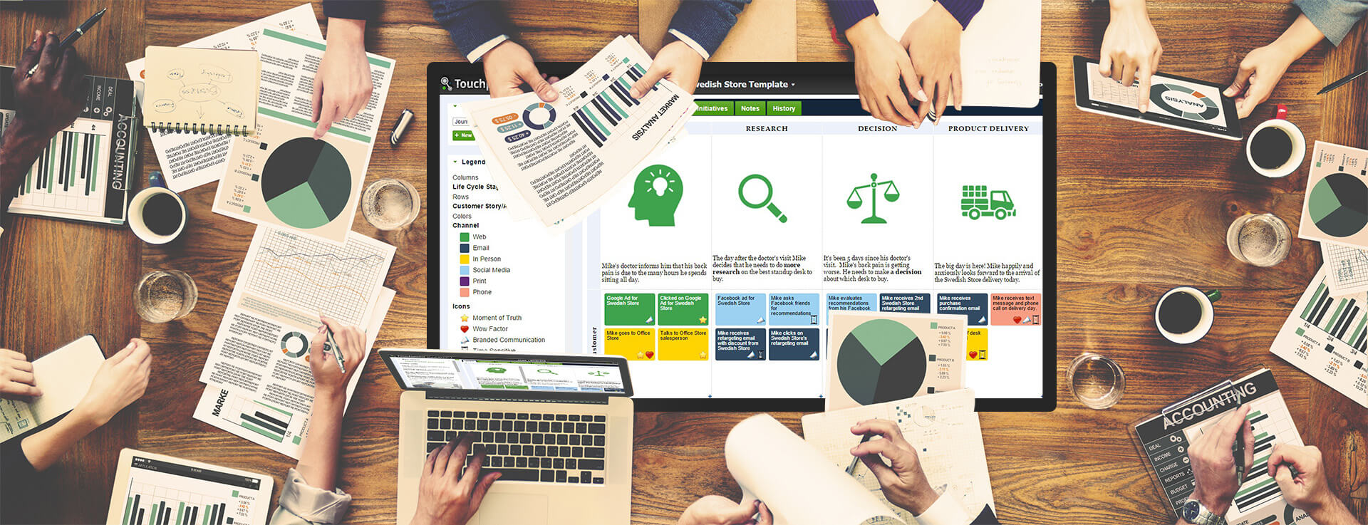
Securing data into shape through visuals is narrowing down to accurate designs of graphs and charts. But did you know that it requires best practices to project the reports for clients? The way planning and executing the merger of data sets is done along with design and overall accessibility constitutes all the difference.
We present the categories and select matching presentations to improve your ability to develop complex process.
Broad categories outline
Each group represents distinctive examples that reflect data visualization. They are clearly recognized when put into a graphic format. Naturally, it is essential to grasp this classification to project the right status of a strategy. It makes attaining the business goals with clarity. The choice of any or a combination of the above types will depend on the following:
- Correlation between the data sets
- How the information is distributed across various channels?
- Its elemental composition
- Comparison which will necessitate the actions
Let’s return to the 5 types to follow how each one is useful to prepare the dashboard or a report for the client.
Chronological or in sequence
This is the most canonical form of presenting the information. It is primarily represented by sequence of events or actions. Ideal representation of chronological sequence is obtained within:
Based on hierarchal clusters
Presenting materials becomes more complex when sub divisions are required. Hierarchal clusters do a good job of adding a profile view of the information. These are presented by diagrams in the form of:
If the material originates from one source, then this is an ideal format to display. In a single diagram, one can interpret the relationships between various resources.
Network defined charts
Many times we need to display data sets of various resources and also combine them. Within networks, several sources need to be collated on a particular platform. The network defined charts are ideal to bring clarity so that too much explanation is unrequired. These are achieved with the support of:
Multidimensional data setting
With the expansion of big data, the way companies need to show the dashboard has changed. Even the way reports are presented have become more sophisticated. The use of 3-D visuals has given rise to multidimensional illustrations. Currently, these remain the most vibrant types of displaying the reports. There is an additional takeaway from this design. Relevant data sets concerning various parties can be broken down in silos, so they need not access the entire diagrams. Independent charts which characterize multi-dimensional settings are:
Based on geographic location in real time
Many companies involve trending data on a real time basis. This is when geospatial configurations are most beneficial. Companies that need to check data when their campaigns are running in the market find flow charts appropriate. They can check trends on social networks, or in other locations. In the recent past political parties have used such data visualization to manipulate their strategies. The most classic examples of this kind include:
Now you are aware of the various types of graphics, maps and in which cases they can be resorted to find out what needs to be conveyed to the audiences. With the help of these pictorial representations, the recall value will also be great. Let’s move on to the next important value of data visualization – when not to use the above for maximum impact. For example, there is no need to fill a map with data that will distract the audience. Or when line charts are used, avoid adding too many complicated positions. It will not sustain the interest and nor will it tell the story as it should be understood. In the same manner number charts become meaningless if the trend indicators are excessively projected. To express the same, employ other designs that will co-relate with statistics. There is no harm in creating another diagram rather than including lines to the existing one. Avoid creating a pie chart if there are less than 5 categories to compare.
Do not forget the best practices
It is fun to add various charts and diagrams to explain the audience research, sales reports and market trends. But adding best practices will make it 100% unique and acceptable to everyone. For instance, if a bar chart should have consistent colors and fonts in the design process. It will assist others to grasp the relationships involved between the data sets. Maintain the facts and figures in order with simple texts. In the case of a line chart avoid adding too many colored lines. For comparisons do not add more than 4 indicators. The slices of a pie chart should be apparent with different colors so that distinguishing the co-relations is easy.


